
Rethinking Class Planning
Designing the mobile experience of a class planning tool for 20,000+ BYU-Idaho students
Registering for classes at BYU-Idaho confused and frustrated students, especially freshmen. I joined a small design team to build a planning tool from the ground up, and owned its full mobile experience.
EdTech, B2C
Role
UX Designer
Team
UX Manager, 2 Designers, Engineers
Duration
May 2023 - Aug 2023

BYU-Idaho’s registration system was outdated and hard to navigate. Freshmen often needed help just to register, and most students found it daunting to build a balanced schedule. The most proactive students wrote their planned sections on paper before registering to see how their options fit together. Stakeholders also knew some courses filled faster than expected, leaving students to rework their plans and still graduate on time.


The tool was proposed to make planning each semester easier and less stressful. When I joined, stakeholders had set what it should do, and the design team had already interviewed students, compared how other universities handle registration, and created and tested very early prototypes.
I joined to carry the prototype forward through iteration. Two of the three designers on the project had just left, so I worked out much of the direction myself, with quick help from my manager and the remaining designer.
I started from the stakeholder requirements and user requests below, and wrote a How Might We statement to keep us aimed at the overarching problem.
Stakeholder requirements
Ability to plan classes all in one tool
Easy experience so all students can use
Registering for classes is easier
Better indication of course demand through viewing students’ plans sooner
Notifications to let students know of relevant changes
User requests
Display of key class information for quick comparisons
Easier registration process
Less stress and scrambling on registration day
Help to plan a more balanced schedule
How might we
What will happen when a student’s planned class becomes full?
This question came up in my second week. Students used to build their schedule on registration day, but our tool asked them to plan far ahead, so a planned class could fill up before they registered. I realized that helping users find promising alternate solutions after they had created a plan would make or break the experience, so I brought our UX manager and the other designer together to map every warning and error and how a student could respond.

When a class fills up:
We tested from low-fidelity wireframes onward: 12 rounds of usability testing and 60+ tests. Here are three parts of the tool I worked on, and what testing changed in each.

Adding courses to the schedule
The other designer and I built a visual schedule builder, because students couldn’t “see” their schedule while planning it. Here’s what students told us.

Tested

Revised design
The class summary
This part took the longest. After planning, students had two next steps: resolve any warnings, like a planned section filling up, and register on their registration date. While the other designer refined the schedule builder, I explored summary page layouts to walk students through both. The feedback below comes from several of those layouts, shown on one for simplicity.

Tested

Abandoning the summary page
Students didn’t need a separate page for next steps. They needed them on the schedule builder they were already using. Each round of testing showed me why an earlier layout fell short, which led to the final design below. With next steps on the schedule builder, students could see there was more to do after planning, and the confusion about registering seemed to fade.


Final design
Registration status up top
“Registered Credits” sits beside planned credits, next to a “My Registration” button.
One page, no tabs
The summary tabs are gone, and waitlist warnings show right on the schedule builder.
A clear next step
A full section offers “Join Waitlist”, with other open sections listed below it.
Getting started
The last piece to figure out was getting students started. They could plan their schedule themselves or begin with one auto-generated from their courses.

Tested


Revised design
The calendar comes first
Students land straight on the weekly calendar, with their course list beside it.
Planning yourself by default
“Auto-Schedule” is now an optional button that opens a short preferences dialog.
One page, no welcome
The welcome screen is gone, and the course list and calendar share one page.
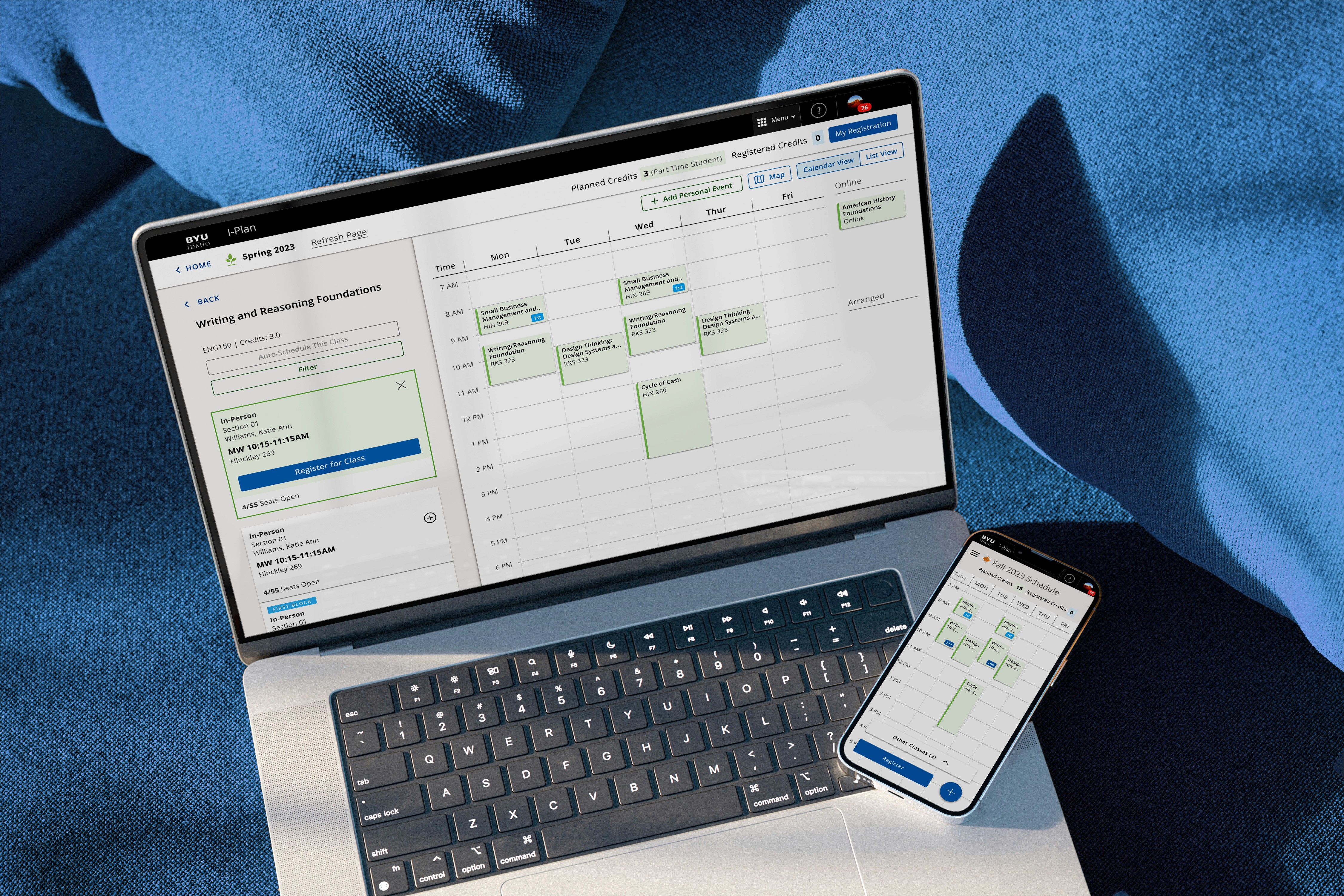
Once the flow was solid, I took on the full mobile prototype. The features were the same, but the smaller screen meant rethinking much of the interface.
I studied Outlook, Google Calendar and iPhone’s Calendar to see how mobile calendars differ from desktop. In all three, the calendar is the primary page, and a secondary overlay is used to add items to the calendar, with a hamburger menu for navigation. I followed the same model: on mobile, the weekly calendar is the main planning view, and students add courses from an overlay.

Mobile planning:
The week at a glance
The weekly calendar fills the screen, with planned and registered credits up top and Register easy to access.
Sections in an overlay
The + button opens a sheet to compare sections, check open seats and register, with the calendar still behind it.
Everything else in the menu
Week, day and map views, My Registration and the Grad Plan sit behind the hamburger menu.
Giving students a high-level view of every semester
I also designed the dashboard students land on before they plan. I wanted it to be a quick, high-level read, so the next upcoming semester carries the main call to action, with past and later semesters still in view. Their declared plan from Grad Planner and their track sit at the top, so even newer students know which semesters to plan for. Feedback before handoff led to a few refinements, and it shipped with the beta as designed.


From start to finish:
1. Start on the dashboard
Students see every semester and begin planning the next one.
2. Choose sections
Students compare a course’s sections beside their weekly calendar.
3. Leave with a full schedule
A complete week, with each class ready to register.
Our team was revamping BYU-Idaho’s design system during this project. Organizing and standardizing it was one of my major contributions, and buttons and other components got major overhauls along the way. The mobile calendar rules I set for this project became part of the system.
After four months, we handed the tool to an outside development company we’d met with throughout the project for input on our concepts and design decisions. We documented the designs with user stories, and I documented the mobile flows. The tool launched in beta to 6,000 incoming freshmen before its campus-wide rollout.
The launch
20,000+
Campus students the tool was built for
6,000
Freshmen in the beta launch
↳ How we tested it
12
Rounds of usability testing
60+
Usability tests across the project
The biggest lesson here came from the work I let go of. The summary page took longer than anything else I designed, and testing kept showing me it wasn’t working. Moving next steps onto the schedule builder was the turning point, and it taught me to trust how users work over what I’ve already built.
The tool launched to 6,000 freshmen and then across campus, and it made registering for classes easier for real students. That’s the kind of impact I want my work to keep having.


